Top Goldman Trader Drops Year-End Chartapalooza
When you check across the mega macro inputs that feed into your markets outlook...
1/ global GDP 2.8% (30bps > consensus),
2/ US GDP 2.6% (60bps > consensus),
3/ China GDP 4.8% (30bps > consensus),
4/ Euro area GDP 1.3% (20bps > consensus),
5/ an ongoing acceleration in productivity growth (great for earnings, more questionable for the labor market),
6/ inflation near target in most major economies (in fact, labor market & rent growth inflation in the US is already below pre-pandemic levels ...), and
7/ 50bps more of non-recessionary Fed cuts.
Goldman's Mark Wilson concludes, that's not a bad set-up. But as liquidity lowers, volumes go vapid, and newsflow slows (allegedly), Goldman Sachs head of hedge fund coverage, Tony Pasquariello (having previously dropped the greatest list of historical market precedents), lays out some 'charts for the road' into these holiday shortened weeks, covering how we got here... and what comes next...
Starting with the macro
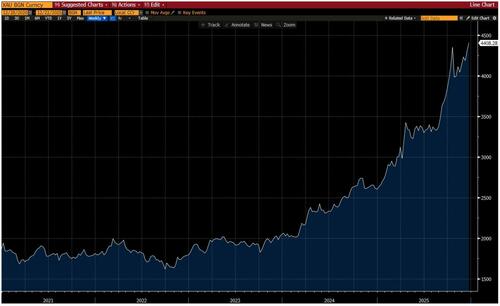
1. ...and the oldest asset of them all -- this is gold. maybe the chart tells a story of fiscal dominance. maybe it’s gathering concerns around fiat currencies. or maybe it’s simply a serious increase in central bank demand. whatever story one wants to tell, this has been the best year for the yellow metal (+68%) since 1979:
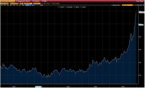
2. then there’s silver, up 139%, also marking the best year since 1979 (when it ripped 5-fold in famous fashion):
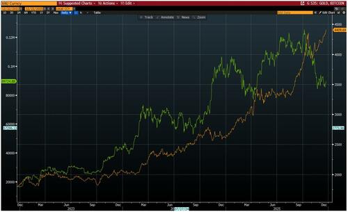
3. while on the topic of stores-of-value, this overlays gold with BTC. as mentioned before, neither of these assets have an intrinsic value, nor do they offer any yield. Therefore, they are principally driven by narratives and flows. While gold continues to be accumulated (by both speculators and reserve fund managers), BTC has been weathering a period of clear outflows:
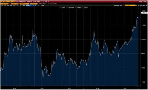
4. one last point on metals. what a year for copper, with a clean breakout to ATH (to say nothing of the rally in the corresponding equities):
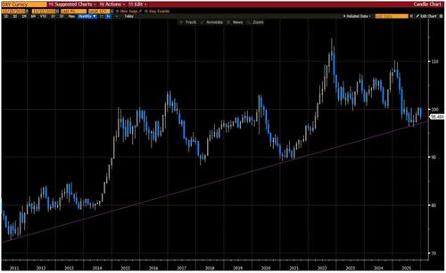
5. relatively speaking, it’s been another year where the opportunity set in currencies was fairly limited. along the way, I kept a close eye on the post-GFC bull uptrend in the dollar (this is a monthly snap). Despite several tests, it continues to hold:
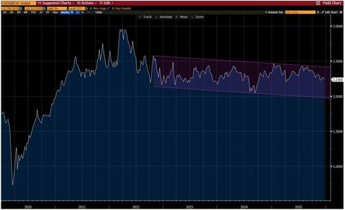
6. I’ve sent this one out a number of times over the past few years. I think it’s very important. it simply plots US 10-year inflation breakevens. since the fever broke in 2022, inflation expectations have been remarkably stable. if the bond market was worried about future Fed leadership, one could argue this wouldn’t be such a well behaved asset:
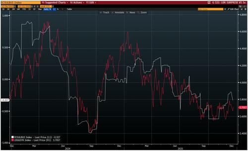
7. speaking of the bond market, I want to revisit an observation from a few months ago. what I wrote at the time:
“I’ve been around long enough to respect the message of the interest rate market. I’ve also been around long enough to believe in the discounting powers of the equity market. with that established, there are times when the signals from each respective market seem to diverge -- now is one of those times, so it’s worth asking why.”
Ok, here’s where it gets interesting. in this plot, the red line is US 5-year note yields, and the white line is a Bloomberg surprise index for US labor market data -- note how tight this fit remains:
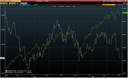
8. ... and in this plot, the green line is S&P, and the white line is a Bloomberg surprise index for US survey data and business cycle indicators. note the striking divergence of late. so, not only were the bond market and the stock market anchoring to different economic narratives, but now the stock market is pricing a cyclical acceleration that’s not yet evident in the data set. to be clear, I’m not saying one of these assets is more right than the other; if anything, I’m saying that the stakes have been raised for the H1’26 acceleration to indeed take place:
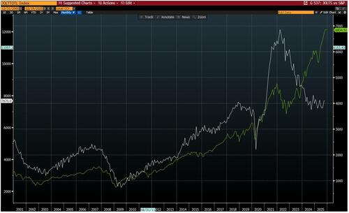
9. one more overlay in this spirit. the white line is JOLTS job openings and the green line is S&P (h/t SM). perhaps 2025 will be remembered as the year when a multi-decade correlation between the labor market and the stock market was properly upended:
The next four charts hit on non-dollar equity markets.
10. to give credit where it’s due, European banks have rallied 90% this year (total return), extending a blistering run (I say all this while politely noting that the ATH from 2007 is still 77% north of here):
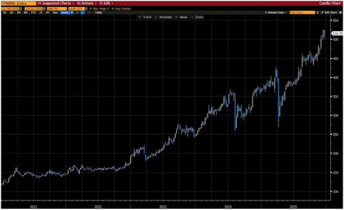
11. the Japanese banks have also had a very strong year, up 45% (for what it’s worth, I have a feeling 2026 could be a wild one in Japanese financial markets):
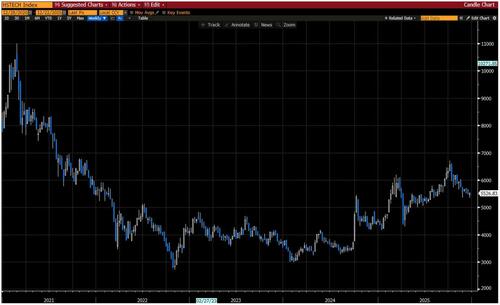
12. Chinese equities have done well this year, a trend which our team expects to continue. now, this is an index of the 30 largest Hong Kong-listed tech companies. it is a marker of two things -- which, when taken together, illustrate the challenge of the asset class: (1) China reminded the world in 2025 that it’s a giant in emergent technologies; (2) expressing that view through domestic equities is not always an easy ride. said another way, note HSTECH has made no real progress from pre-Liberation Day levels:
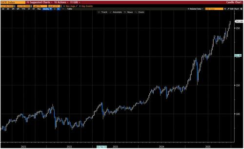
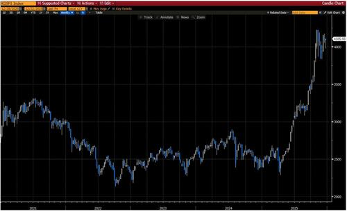
13. the king of Asian equities this year -- if not the king of global equities -- has been Korea. note KOSPI is up 74% YTD, nearly doubling off the Liberation Day lows:
Back to the US.
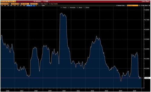
14. this is S&P 6-month realized correlation, which is one way to illustrate the recently high level of dispersion. my expectation is dispersion will remain elevated (and, thus, correlation will remain low) in the next phase of the game:
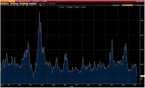
15. this is VVIX, aka the volatility of volatility. I admit that I’m never sure what to think of this metric -- I generally find it more descriptive than predictive -- but it fits with the prior chart, and it tells an interesting story of the chronology of 2025:
I’ll end with a few big picture charts.
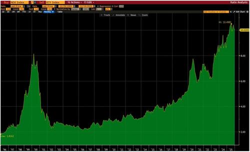
16. this is the ratio of NDX over RTY. as I’ve quipped before: “meet the new boss, same as the old boss.” now, do I think that small cap can perform locally well if the Fed provisions more liquidity into a cyclical acceleration? I do. structurally speaking, do I think that small cap will outperform mega cap tech? I do not:
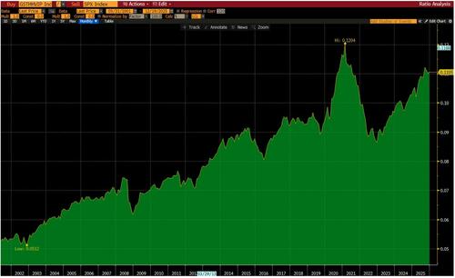
17. while I’m not perfectly objective, I’d argue it’s been a very good year for the hedge fund community. in that context, this long-term chart is interesting: the ratio of our hedge fund VIP basket vs S&P. as you can see, with the exception of the meme fireworks circa 2021, there’s a clear and steady pattern of alpha in this basket:
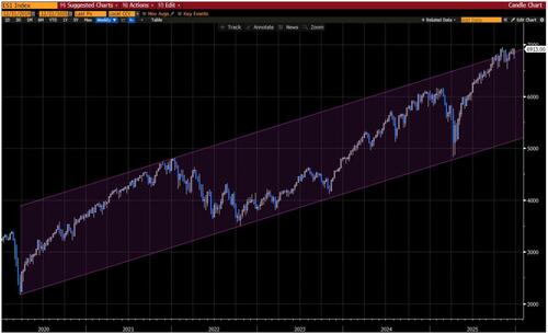
18. I will end in the same place that I did 12 months ago: the bull uptrend in S&P off the COVID low. 2025 brought another dose of gut checks. and, again, money management is FAR more difficult than the chart suggests. in the end, however, US equities did what they do best. now the question becomes one of risk/reward given where the upper bound of this trend comes in:
With all that in mind, Citadel's Scott Rubner confirms, markets enter 2026 with a solid macroeconomic foundation. Retail participation is structurally higher, supported by record household wealth, broadening equity ownership, and substantial cash balances. Rotation across indices, sectors, and commodities signals healthier market breadth, while earnings momentum continues to diffuse beyond a narrow leadership cohort.
Policy dynamics reinforce this constructive outlook. Fiscal impulse is turning positive, monetary conditions are easing, and political uncertainty is diminishing. Positioning remains far from crowded, with persistent retail demand, rebuilding institutional exposure, and favorable seasonal dynamics in January.
The path forward may not be linear, but the ingredients for continued upside are in place. With participation broadening, profits expanding, and policy becoming more accommodative, we remain constructive on the macro and market structure outlook for Q1 2026 and beyond.
Professional subscribers can read much more from Goldman's Sales & Trading team here at our new Marketdesk.ai portal


