Fed Rate Cuts: Magic Trick or Market Trap?
What’s behind the numbers?
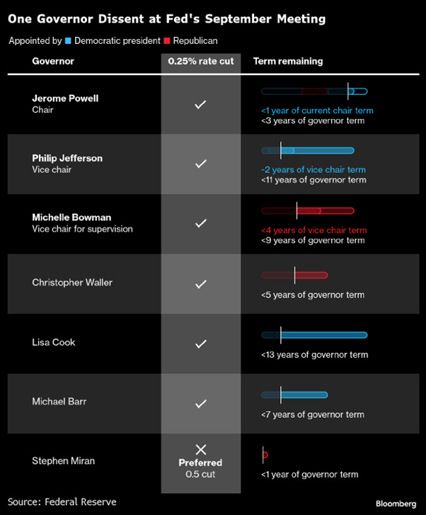
As widely expected, and fully priced — and just nine months after hitting the “pause” button — the Fed finally caved to political pressure and shaved its funds rate from 4.50% to 4.25%. It’s only the second-longest wait since the 1970s — the last time was back in 2001–2002, when markets were in the gutter, consumers were broke, and inflation was basically a no-show. This time? Not so much. The lone dissenter was Stephen Miran, fresh in the job and already gunning for a bigger 50 bps cut — talk about making an entrance.
According to its SEP, the Fed now expects inflation to finally crawl back to 2%… in 2028. That’s seven straight years of overshooting the target — a perfect streak if you’re running a central bank comedy show. Still, that’s better than the nine years of chronic undershooting we endured from 2012 to 2020. GDP forecasts got a lift for 2025–2027, unemployment is unchanged for 2025 but slightly sunnier for 2026 and 2027, and PCE/Core PCE projections are mostly unchanged except for a nudge higher in 2026 — because why not keep everyone guessing?
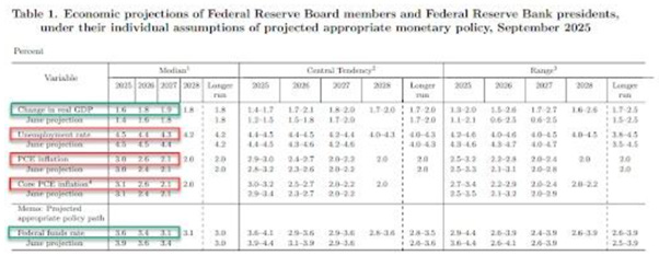
The 2025 dot plot was taken to the chopping block, with one member apparently slamming the “Cut!” button five times — presumably Stephen Miran, fresh off his appointment by Donald Copperfield to run monetary policy like a Vegas magic act, making money disappear for savers and reappear for debtors (including certain failed real estate-mogul-turned-politicians). Of the 19 Fed members, 7 see no more cuts this year, 9 see two, 2 see one, 6 see none (yes, the math makes sense somehow), and one brave soul even sees a hike. The Fed funds forecast for 2025 was trimmed from 3.9% to 3.6% — essentially just one more cut after the expected two this year. The dot plot still leans toward slower cuts near term, but the 2026 median moved lower and five members now think we’ll be under 3% by then. Toss in another trim for 2027 to 3.1%, and that’s 125 bps of cuts from September 2025 to the end of 2027 — far short of the 300 bps ‘The Manipulator In Chief’ turned Central Banker wanted, preferably “yesterday.”
The FOMC statement read like a classic Fed compromise: a little something for everyone and a headache for anyone trying to make sense of it. They’re cutting rates, promising more cuts, talking up growth, and casually admitting inflation might run hotter — basically saying, “Yes, the economy’s on fire, so we’re lowering the price of matches.”
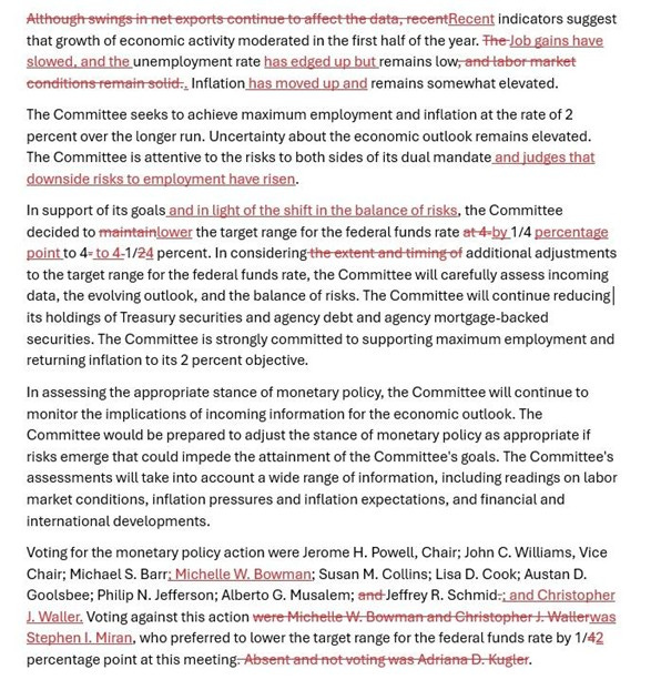
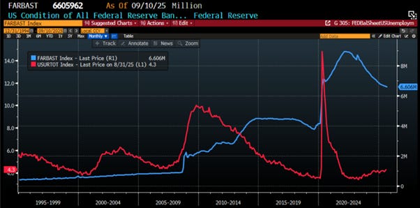
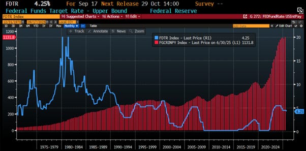
The Fed, never one to miss a chance to confuse everyone, cheerfully announced it’ll keep shaving $5 billion a month off its $6+ trillion balance sheet. Because nothing says “don’t panic” like slowly chipping away at a mountain of IOUs with safety scissors — and hoping no one notices the pile isn’t getting any smaller.
FED Balance Sheet (blue line); US Unemployment Rate (red line).
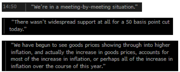
At his press conference, the “Central Banker in Chief” faced a grilling as reporters pointed out the glaring gap between his rate-cut rationale and the Fed’s own forecasts. He blamed “downside risks to employment” and “weak housing activity,” then promptly muddled the message by admitting inflation is still expected to rise — just not as much as before. He wrapped it all in a bow by calling it a “risk management” cut, insisting there was “no widespread support” for a bigger 50bps move. Tariffs went unmentioned, but he conceded that goods prices are pushing inflation higher, before quickly assuring everyone that the inflation threat has somehow… eased. Classic central banker magic trick: cut rates, promise growth, downplay risks — all in one breath.
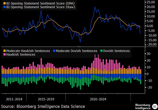
Powell’s opening remarks leaned noticeably more dovish than last September, when the Fed — under election-year pressure — went for a hefty 50bps cut. This time, the tone was softer, the move smaller, and the political subtext just as hard to miss.
Thoughts
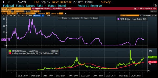
To grant the grand illusion of Donald Copperfield, Wall Street still treats the Fed like a wizard with a shiny lever labelled “soft landing.” But reality, rude as ever, keeps barging in uninvited. Take a peek at the Fed Funds rate and the S&P 500-to-oil ratio — every rate cut is basically the Fed hollering, “Dinner’s ready!” to the bust cycle. That ratio soars like a helium balloon, then nosedives like a kamikaze seagull straight through its 7-year moving average.
Upper Panel: FED Fund Rate (purple line); Lower Panel: S&P 500 to WTI ratio (green line); 7-Year Moving Average of the S&P 500 to Oil ratio (red line).
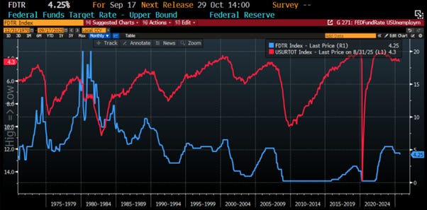
Investors should keep in mind that while Wall Street loves to imagine the Fed as some all-powerful puppeteer pulling the strings of interest rates, reality makes for a much less flattering puppet show. Historically, every time the Fed starts cutting rates, it’s not the “all clear” signal — it’s usually the moment unemployment starts climbing. And let’s be honest: the odds of “this time being different” are about as good as finding a diet plan that lets you lose weight eating cheesecake for breakfast.
FED Fund Rate (blue line); US Unemployment Rate (axis inverted; red line).
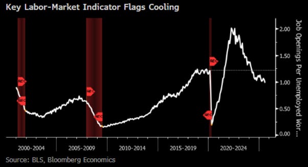
For the first time since 2021, last August, the unemployed now outnumbered job openings — 7.24 million Americans competing for 7.18 million slots. Call it stagflation’s version of musical chairs, only the music stopped years ago. Companies are slashing costs under the weight of taxes, regulation, and sticky inflation, while AI happily takes over the jobs that aren’t being outsourced abroad. The result? Employers won’t expand, workers can’t keep up, and politicians will “fix it” with more regulation, higher taxes, and wage mandates — exactly the medicine that keeps making the patient sicker.
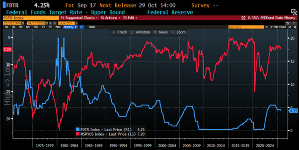
The sad reality is that, despite Wall Street’s bedtime stories and its army of fake-news fairy godmothers, anyone with half a brain — or at least the ability to read a chart without drooling — can see the trick. Every time in history the Fed starts snipping rates, the so-called “misery index” (a cocktail of unemployment and inflation) doesn’t go down… it shoots up. Translation: rate cuts are less a magic wand and more like Jerome Powell handing you an umbrella just as the hurricane makes landfall.
FED Fund Rate (blue line); US Misery Index (axis inverted; red line).
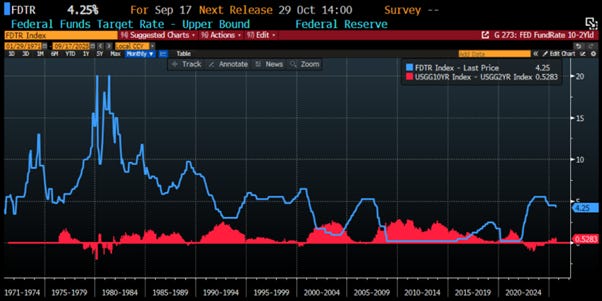
Everyone pretends the Fed cares about Main Street, but the only street it has ever protected is Wall Street — and the banksters know it. Every press conference starts with lofty claims about “the American people,” then quickly morphs into a love letter to the markets. History shows the same pattern: when the Fed starts cutting rates, the yield curve stops playing limbo and starts climbing. The 10-year minus 2-year spread steepens, peaking only once the Fed Funds rate has found its new “floor” — which is basically code for “we’ve hit bottom, folks.”
FED Fund Rate (blue line); Spread between US 10-Year Yield and US 2-Year Yield (red histogram).
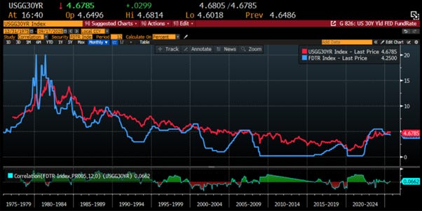
This is common sense to anyone who’s spent more than five minutes with a bond chart. The Fed can mash buttons on short-term rates like it’s playing Mario Kart, but the real economy runs on the big boys — the 10-Year and 30-Year — set by the market, not by the “Central Banker in Chief’s” mood swings. Buying a house, a car, or building a business? Those long-term rates decide your fate. And the Fed’s control over them? About the same as its control over the weather — which is to say, Jerome Powell is no more a rainmaker than he is a rate-whisperer.
US FED Fund Rate (blue line); US 30-Year Yield (red line) & Correlation.
US 5y5y inflation swaps have been creeping up since Liberation Day in April, while 2-year Treasury yields have been tumbling since mid-May. The Fed’s political drama isn’t helping short-term yields took a nosedive after Adriana Kugler quit on August 1, and again when Donald Copperfield announced Lisa Cook was out on August 21. Meanwhile, long-term real yields stayed stubbornly high, creating what looks on the chart like an alligator’s jaw snapping shut. Wall Street, meet your new favourite creature feature.
US 5y5y inflation swaps (blue line); US 2-Year Treasury Yield (red line).
The White House keeps nudging the Fed to cut rates, even though the current backdrop screams for higher ones if the inflation mandate still means anything. But here’s the kicker: the Fed has about as much influence on government spending as a traffic cop has on a stampede. Interest payments will keep ballooning regardless, because at the end of the day, even zero rates can’t save you if Uncle Sam insists on spending like a drunken sailor with a stolen credit card.
FED Fund Rate (blue line); US Current Expenditures Interest Payments (red histogram).
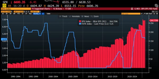
For corporate America, rate cuts are less a victory lap and more a distress signal. History shows they usually mean weaker, not stronger earnings — with EPS sinking until the Fed finally dusts off its courage and starts hiking again. In other words, profits don’t bottom when money gets cheaper, but when the ‘Central Banker In Chief’ starts playing tough guy.
FED Fund Rate (blue line); S&P 500 Best EPS (red histogram).
So, it’s hardly shocking that once the Fed pulls out the scissors and starts cutting rates, equity returns usually go from lively to muted — and before long, they often slide straight into the red. Think of it as Wall Street’s version of a hangover: the party ends the moment Jerome brings out the rate cuts.
FED Fund Rate (blue line); S&P 500 Index (red line); S&P 500 12-months Return (yellow histogram).
Sector patterns make it pretty clear: when the Fed starts cutting, it’s usually a win for the folks pumping oil, not the ones coding apps. Energy producers (hello, Dow Jones) tend to shine, while energy-hungry tech stocks (sorry, Nasdaq 100) start sweating. Translation: this rotation show has likely just begun, and Silicon Valley might want to carpool with Exxon for a while.
FED Fund Rate (blue line); Relative Performance of the Nasdaq 100 to Dow Jones Index (red line); Nasdaq 100 to Dow Jones Ratio 12-months Return (yellow histogram).
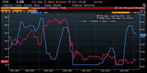
The Financials sector, meanwhile, seems allergic to rate cuts. Historically, it underperforms the S&P 500 — sometimes even ducking for cover before the Fed has swung its scissors. Banks and brokers remain the canaries in the interest rate coal mine.
FED Fund Rate (blue line); Relative Performance of the S&P 500 Financials Index to S&P 500 Index (red line)
Finally, let’s talk gold...
Read more and discover how to trade it here: https://themacrobutler.substack.com/p/fed-rate-cuts-magic-trick-or-mark…
Join The Macro Butler on Telegram here : https://t.me/TheMacroButlerSubstack
You can contact The Macro Butler at info@themacrobutler.com
If this research has inspired you to invest in gold and silver, consider GoldSilver.com to buy your physical gold:
https://goldsilver.com/?aff=TMB

Disclaimer
The content provided in this newsletter is for general information purposes only. No information, materials, services, and other content provided in this post constitute solicitation, recommendation, endorsement or any financial, investment, or other advice.
Seek independent professional consultation in the form of legal, financial, and fiscal advice before making any investment decisions.
Always perform your own due diligence.