The 10 Charts We Are Watching This Saturday
Welcome weekend
CTAs swing wildly, risk appetite collapses, tech suffers its largest outflows in 4 years, and AI finally shows up in real earnings. Here are the 10 charts we’re watching this weekend — from market panic to full-stack AI dominance.
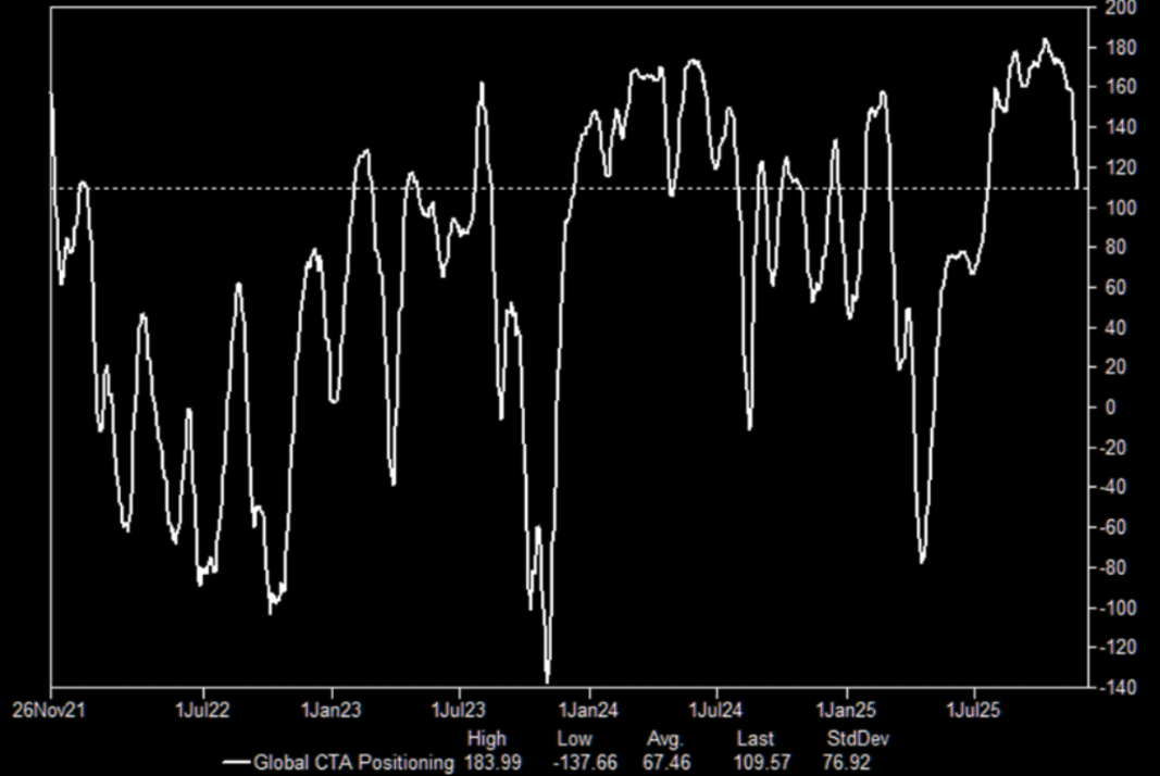
1 - CTAs
What is the next CTA (call to action) for the CTA community in terms of signals... This is probably (one of) the most important swing factors to determine if we have a Santa rally or a Bad Santa...
Source: GS Prime
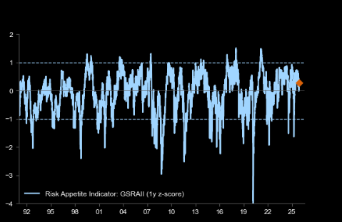
2 - A doughnut
GS: "Our Risk Appetite Indicator has dropped to 0."
Source: Goldman
3 - Tech outflows
Tech saw the biggest outflow in over 4 years. Here measured as rolling 4-wk avg. Tech ETF flows as a % of Tech mkt. cap.
Source: BofA
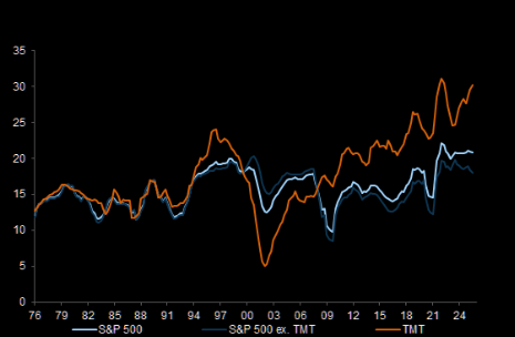
4 - More profitable than in the bubble
Yes we have some outflows and we have a lot of bubble talk but never forget that US TMT stocks are more profitable compared to the Tech Bubble and the rest of the market. Chart shows return on equity (ROE, %).
Source: Compustat
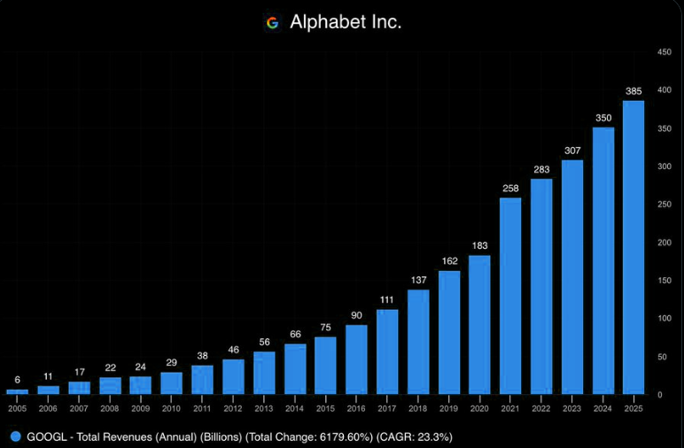
5 - The ultimate AI play
Google operates in every layer of the AI value chain.
1. Hardware Layer: Design their own TPUs.
2. Infrastructure Layer: Google Cloud for compute.
3. Data Layer: Consume training data from Search, YouTube, etc.
4. Foundational Layer: Leading model in Gemini 3.
5. Application Layer: Deploy AI capabilities to Search, Gmail, Maps, etc.
Can any company replicate this?
Source: fiscal.AI
6 - Own the “using AI, not selling AI” theme
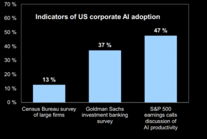
"The AI trade continues to broaden. Three years post-ChatGPT, AI is finally showing up in earnings — companies across the old economy are rolling out real AI tools tied to cost reduction and margin lift. That’s the idea behind the new GS basket, GSXUPROD Index: a clean way to own the “using AI, not selling AI” theme as AI shifts from narrative to measurable productivity." (Lee Coppersmith, GS trading)
Source: GS
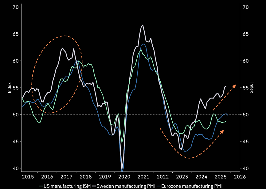
7 - Reflation
Early signs of cycle bottoming. Chart shows Manufacturing PMI indices.
Source: Macrobond
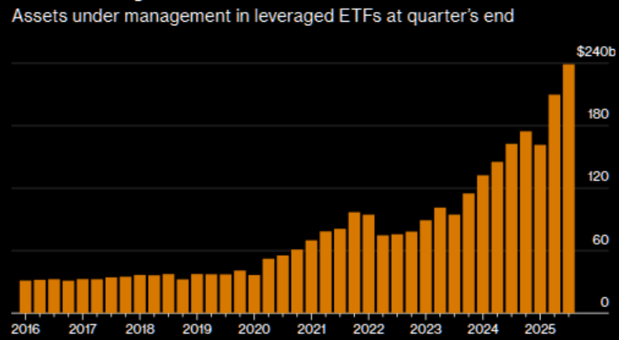
8 - Thrill-seeking via leverage
Investors have now plowed $239 Billion into Leveraged ETFs, the highest amount in history.
Source: Bloomberg
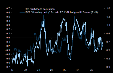
9- That "central bank put" regime
GS: "Equity/bond correlations turned more negative recently as markets shifted to a 'central bank put' regime." Chart shows S&P 500 vs. US 10-year bonds.
Source: Goldman
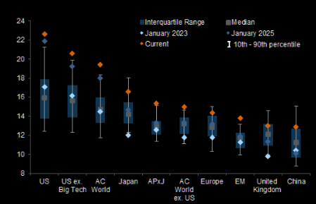
10 - US expensive
US equities are particularly expensive, even excluding large cap Tech stocks.


